

Style relies on color very heavily. We process color, harmonies, clashes, etc. and in turn our experience is shaped. Our moods are altered. Color is very powerful. Heck, there's an entire company devoted to the color of things. If you are outside of the design world you may have never heard of PANTONE. They are the color authority for all sorts of different substrates. Paper, inks, plastics, cotton, you name it! They have lots of tools to help you understand and use color. They also have a lot of forecasting guides so you can see color trends. Very cool!
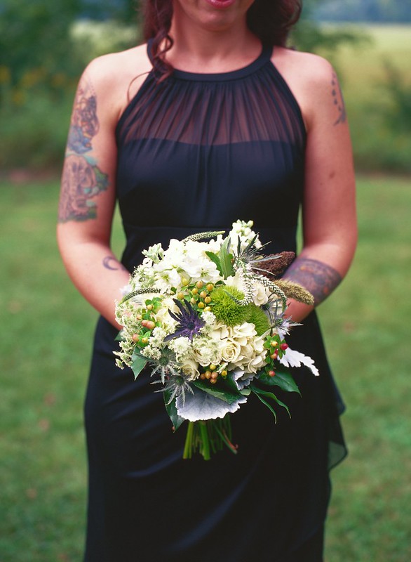
Color is a very critical part of a photo. The color harmony between the flowers and the tattoos on this bridesmaid immediately caught my attention. The blues, greens, reds, purples, and yellows all seemed to be perfectly matched. I made sure to feature them together in at least one frame.
I shot this using KODAK EKTACHROME E100 VS reversal film which I knew would yield lots of blues and lots of reds. The dress is actually black, but I knew it would render a bit like purple. I'm happy it did! It matches perfectly with the purples in the flowers and the tattoos!


No comments: